A well-designed landing page can be the difference between a visitor bouncing or becoming a customer. Unlike general website pages, landing pages are focused on a single goal whether it’s capturing leads, selling a product, or driving sign-ups.
But what separates a high-converting landing page from one that falls flat?
In this guide, we’ll break down:
✅ The key elements of an effective landing page
✅ Psychological triggers that boost conversions
✅ Real-world examples of winning designs
✅ Common mistakes to avoid
Optimized for business owners, marketers, and designers looking to improve conversions while boosting SEO for your web design studio website.
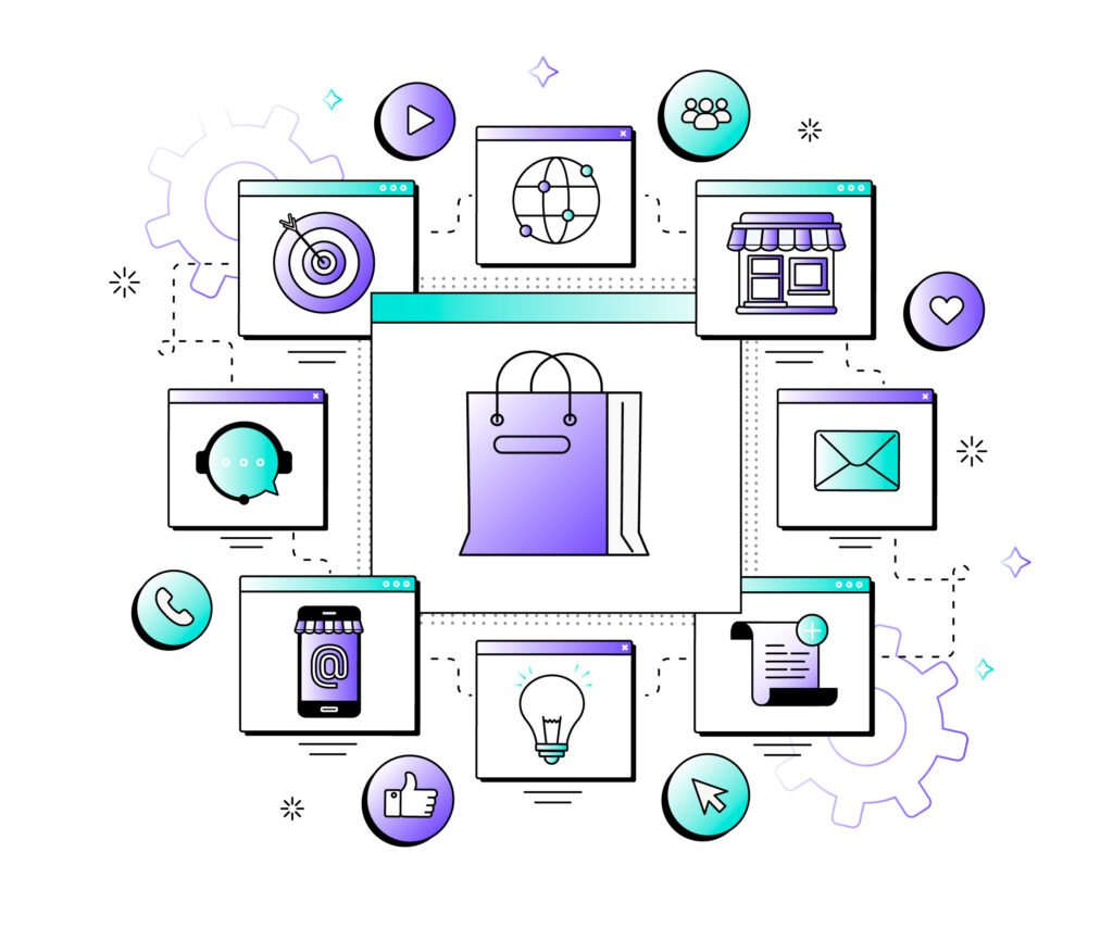
Why Landing Pages Matter
Landing pages are the backbone of digital marketing campaigns because they:
- Eliminate distractions (no navigation menus, sidebars, or exit links)
- Focus on one clear CTA (Call-to-Action)
- Increase conversion rates by 20-50% compared to standard web pages
If your landing page isn’t optimized, you’re wasting ad spend and losing potential customers.
The 8 Essential Elements of a High-Converting Landing Page
1. A Strong, Benefit-Driven Headline
- Hook visitors in 3 seconds or less.
- Avoid vague statements—be specific.
✅ Example:
❌ “Get Our Software”
✔ “Boost Your Sales by 200% with AI-Powered Analytics”
2. A Clear Value Proposition
- Answer: “Why should I care?”
- Use bullet points for scannability.
✅ Example:
✔ “Save 10+ hours/week”
✔ “No coding required”
✔ “Trusted by 10,000+ businesses”
3. A Persuasive Hero Image or Video
- Show the product in action or a happy customer.
- Videos increase conversions by 80% (Wistia).
4. A Single, Unmissable CTA
- One primary action (e.g., “Get Started Now,” “Download Free Guide”).
- Contrasting color (e.g., orange button on a blue background).
5. Social Proof & Trust Signals
- Customer testimonials
- Trust badges (SSL, money-back guarantee)
- Logos of well-known clients
6. A Simple, Frictionless Form
- Fewer fields = higher conversions (Name + Email often works best).
- Use auto-fill and input validation for better UX.
7. Urgency & Scarcity Tactics
- “Only 3 spots left!”
- Countdown timers (e.g., “Offer expires in 2:14:59”)
8. Mobile Optimization
- 50%+ of traffic comes from mobile—design for thumb-friendly scrolling.
- Test load speed (under 3 seconds).
Psychology Behind High-Converting Landing Pages
1. The “Hick’s Law” Effect
- Fewer choices = faster decisions.
- Remove unnecessary links, menus, and distractions.
2. Color Psychology
- Red/Orange CTAs = Urgency
- Green CTAs = Trust (e.g., “Safe & Secure Checkout”)
3. The Zeigarnik Effect
- People remember unfinished tasks.
- Use progress bars (e.g., “Complete your signup in 2 steps”).
Landing Page Examples That Convert
1. Shopify (Free Trial Offer)
- Clear headline: “Start your free trial today.”
- Minimal form (just email, no credit card).
- Trust badges (“No risk, cancel anytime”).
2. Dropbox (Freemium Model)
- Simple value prop: “Get 2GB of free cloud storage.”
- Strong CTA contrast (blue button on white).
3. Airbnb (Emotional Storytelling)
- Hero video of happy travelers.
- Scarcity trigger: “Book before dates sell out!”
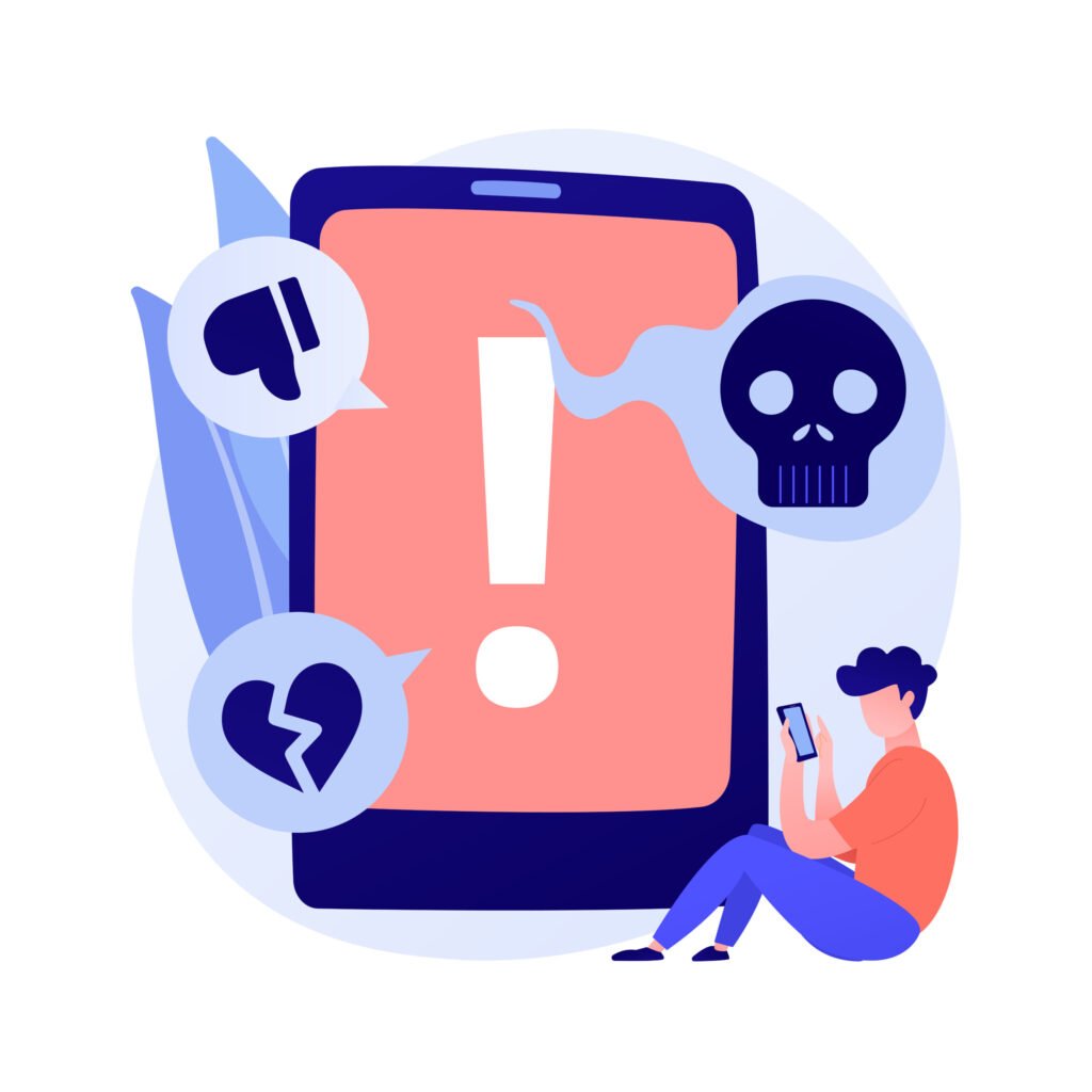
Common Landing Page Mistakes to Avoid
❌ Too many CTAs (Confuses visitors)
❌ Weak headlines (Fails to grab attention)
❌ Slow load times (Kills conversions)
❌ No mobile optimization (Loses 50%+ of traffic)
How Landing Pages Impact SEO (Indirectly)
- Lower bounce rates (Engaged visitors stay longer)
- Higher dwell time (Signals quality to Google)
- More conversions = Better ROI on paid ads
Need a High-Converting Landing Page?
Our web design studio specializes in conversion-focused landing pages that turn visitors into customers.
🚀 Book a free consultation to see how we can boost your conversions.
 Quick View
- Quick View
- Quick View
- Quick View
- Quick View
- Quick View