In the competitive world of online shopping, your ecommerce design isn’t just about aesthetics it’s a powerful tool that taps into human psychology to drive sales. Understanding how color, layout, and UX principles influence buyer behavior can increase conversions, reduce cart abandonment, and build trust.
In this in-depth guide, we’ll explore:
✅ The psychological triggers behind successful ecommerce design
✅ How to apply these principles to your online store (WordPress/WooCommerce or Webflow)
✅ Real-world examples of brands using psychology effectively
✅ How these strategies indirectly boost SEO
Optimized for eCommerce store owners, marketers, and designers looking to leverage psychology for higher sales while attracting potential clients to your web design studio website.
Why Psychology Matters in Ecommerce Design
Studies show that 90% of purchasing decisions are made subconsciously, driven by emotions rather than logic. A well-designed store guides users toward checkout by:
- Reducing friction (cognitive load)
- Building trust (social proof, security cues)
- Creating urgency (scarcity, FOMO)
Let’s break down the key psychological principles that impact buying behavior.
6 Psychological Triggers in Ecommerce Design
1. The Power of Color Psychology
Colors evoke emotions and influence actions:
- Red = Urgency (sales, discounts)
- Blue = Trust (banks, tech brands)
- Green = Eco-friendliness (organic products)
- Black = Luxury (high-end fashion)
Pro Tip: Use contrasting colors for CTAs (e.g., orange button on a blue background).
2. Hick’s Law: Simplify Choices
- Too many options paralyze decision-making.
- Limit product variants (3-4 choices max).
- Use smart filters to guide users.
Example: Apple’s clean product pages focus on one primary CTA (“Buy Now”).
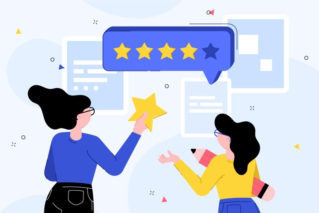
3. Social Proof & FOMO (Fear of Missing Out)
- 92% of consumers trust peer reviews over ads.
- Design elements to include:
✅ Customer reviews with photos
✅ “Bestseller” or “Limited stock” badges
✅ Live purchase notifications (“10 people bought this in the last hour”)
4. The Paradox of Choice: Less is More
- Shoppers are 10x more likely to buy when shown fewer options.
- Strategies:
✔ Curate “Editor’s Picks”
✔ Highlight “Most Popular” instead of endless grids
5. Scarcity & Urgency Tactics
- “Only 3 left in stock” increases conversions by 226%.
- Countdown timers (for flash sales) create urgency.
Best Practices:
- Use real-time inventory (fake scarcity backfires).
- Place urgency cues near the price or CTA.
6. The “Decoy Effect” for Pricing
- Adding a premium-priced option makes mid-tier products seem like a better deal.
- Example:
- Basic: $29
- Pro: $59 (most chosen)
- Premium: $99 (makes Pro look reasonable)
How to Apply These Principles to Your Store
For WordPress/WooCommerce Stores
- Plugins for Psychology-Driven Design:
- Trust badges: TrustPulse (social proof notifications)
- Scarcity: WooCommerce Stock Manager
- Reviews: YITH WooCommerce Reviews
- Design Tweaks:
- Simplify checkout to 1-2 steps max.
- Use warm colors for discount sections.
For Webflow Ecommerce Stores
- No-Code Tools:
- FOMO: Jetboost (real-time sales pop-ups)
- Scarcity: Foxy.io inventory alerts
- Visual Best Practices:
- Hero sections that highlight benefits, not just features.
- Sticky add-to-cart bars for mobile.
How Psychology-Driven Design Improves SEO
- Lower bounce rates (better UX = longer visits).
- Higher conversion rates (Google rewards engagement).
- More user-generated content (reviews = fresh SEO content).
Common Mistakes to Avoid
❌ Overloading with popups (hurts UX).
❌ Fake scarcity (destroys trust).
❌ Ignoring mobile psychology (thumb-friendly CTAs matter).
Need a Store Designed to Convert?
Our web design studio specializes in conversion-focused ecommerce design that taps into buyer psychology.
🚀 Book a free audit to see how we can increase your store’s sales.We specialize in psychology-driven ecommerce design for WordPress and Webflow.
 Quick View
- Quick View
- Quick View
- Quick View
- Quick View
- Quick View